Author: Safford Black
Safford Black is the founder and Chief Operating Officer of OnePager, the developers of plan communications software with the same name. OnePager is an add-on to Microsoft Project that turns project data into summary graphics in seconds. Safford has held various management positions in the technology industry for more than a decade and holds a BA in psychology and management from Rice University. Learn more about OnePager.

OnePager: Project Timeline and Gantt Chart Applications for Microsoft Project, Project Online and Project Server
Are you looking for a timeline or gantt chart application to make project reporting easier? Learn more about OnePager Pro here!
OnePager: Data-Driven Timelines from Project Desktop or Project Online
OnePager Pro helps project managers create data-driven timelines and Gantt charts directly from Microsoft Project plans. Learn how to choose from multiple layouts, group tasks into swimlanes, apply conditional formatting, and easily update your visuals as your project evolves.
Introduction to OnePager Pro for Microsoft Project
OnePager Pro is a tool that allows users to create data-driven project timelines and Gantt charts from Microsoft Project plans. Learn about its key features, including multiple layout options, swimlanes, conditional formatting, and the ability to quickly update and track changes.
Best Practices for Making Use of Formulas in Microsoft Project
Project Management Institute (PMI)® Professional Development Units (PDUs): This Webinar is eligible for 1 PMI® PDUs in the Technical category of the Talent Triangle. Event Description: Take your Microsoft Project plans to the next level by learning how to use formulas to compute key project information. Learn when a formula will work and when it won’t, plus practical tips on creating powerful formulae that are easy to build and maintain. Presenter Info: Safford Black is the founder and Chief Operating Officer of OnePager, the developers of plan communications software with the same name. OnePager is an add-on to Microsoft Project that turns project data into summary graphics in seconds. Safford has held various management positions in the technology industry for more than a decade and holds a BA in psychology and management from Rice University. Learn more about OnePager. Have you watched this webinar recording? Tell MPUG viewers what you think! [WPCR_INSERT]
MS Project Formula Tips
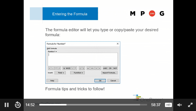
Microsoft Project formulae are a powerful way to introduce custom calculations into your project plan. Many people who may be familiar with writing formulas in Excel find Microsoft Project’s formula editor a little less intuitive, so this article will give you a basic introduction to formulas in MS Project. I hope you can get started with the following steps and then view my on-demand webinar on the topic, which will provide more in-depth advice on how to write formulae in Microsoft Project. Step One: Pick a Data Type First, you’ll want to ensure that you pick the correct data type for the Microsoft Project field that will store the result of your formula. You can apply a Microsoft Project formula to any type of field, but some types of fields are more natural fits for formulae than others. In general, you want to pick a field type that matches the type of calculation that you are planning to perform. Good choices include: Numbers Dates Text (strings) Flag (Boolean) These types of fields are well-suited to formulae because their results are easy for a formula to compute without any special formatting. Duration and cost fields, on the other hand, are not great choices because they require special formatting. For example, a duration field is formatted using a number and a unit (“3 days”), which can be hard to achieve when writing a formula compared to simply computing a plain “3” in a number field. Step Two: Pick a Good Custom Field When picking a destination field in Microsoft Project that will store the result of your calculation, you want to avoid special-purpose fields that are automatically calculated by Microsoft Project and can’t be edited. Examples of these read-only fields include Critical, Outline Level, Status, Overallocated, and WBS, though there are dozens more. To be safe, it’s best to select one of the generic Microsoft Project local custom fields, such as Number 1-20, Date 1-10, Text 1-30, and Flag 1-20. Step Three: Don’t Step on Toes You also want to make sure that your newly-created formula doesn’t inadvertently delete other information that has already been stored in same field. When you create a formula, any previous values in the target field will be overwritten, so it’s very important to make sure that the field that will hold your formula isn’t being used by you or someone else for another purpose. The easiest way to double-check this is to insert the field into Microsoft Project, and then click on the column header to filter the field as shown in the following screen shot. If you see lots of different values appear in the filter list, that’s a good indication that the field is already being used for something else, so it’s best to place your formula elsewhere. On the other hand, if you just see one value and it’s set to “(blank)” or something to that effect, you should be good to go. Step Four: Write and Test Once you have selected where the formula should reside, it’s time to write the formula itself. See below. The Field dropdown will let you select available fields to use in your calculation. The Function dropdown is used to apply different calculations to the fields, though you can also use simple mathematical operators to do many of the same things without getting into the more advanced functions. So, if you wanted add the values of “Number1” and “Number2” and display that sum in the “Number3” field, your formula would look like this: It’s not uncommon for a formula to give an unexpected result or even fail completely the first few times, so don’t get discouraged. Start with small, simple formulae and then work your way up into more complex or nested logic. If needs be, you can break a formula up into smaller parts, where some portions of the formula are calculated in one field and other portions are calculated in a separate field. This lets you see the intermediate results before everything is combined. Once those separate components of the formula look correct, they can be combined into a single formula in a single field so as to not take up extra space. For tips on how to write a Microsoft Project formula, including recommended functions, examples, and other best practices, I hope you will watch my on-demand webinar.

Consider Bringing a Portfolio to Your Next PM Job Interview
Would you hire an architect to build a new house if you hadn’t even seen photographs of some of his past designs? What about a plastic surgeon if you hadn’t seen proof of their past work? Sure, the plastic surgery example is a bit tongue-in-cheek, but the underlying point is not. When people are looking to hire someone to perform a specific job, they don’t want to just hear a future employee say what they’ve done. Whether we’re talking an architect, a plastic surgeon, or yes, even a project manager, people hiring want to see evidence of past work in order to evaluate a potential candidate. We know that seeing is believing and that a picture is worth a thousand words. Yes, there are a number of other clichés that drive this point home, but why do some professions rely so heavily on visual portfolios, while those of us who work in project management continue to stick to resumes alone? The next time you’re applying for your dream job in project management, perhaps a visual or two will set you apart from your competition. In this article, we’ll explore some recommended best practices for building a visual project portfolio. Based on interactions with thousands of project managers, many of whom have moved from one PM role to another in the time that I’ve known them, I’ll give you my pointers for choosing the right projects, conveying your management skills visually, and maintaining confidentiality. Selecting the Right Projects The projects that you choose to display in your portfolio depend largely on the breadth and depth of your project management experience. If you have a long, storied career in project management, you’ll want to refrain from including too many projects. You want to make a good impression, but be selective. No hiring manager is going to look at more than a handful of examples anyway. If you’re relatively new to the world of project management, you’ll understandably have fewer projects from which to choose. Even if you have only ever managed one project in your life, you can create a few different views of that one project in your portfolio to draw people in. In general, a portfolio of three to five projects works well. Anything more than that, and you’ll overwhelm people. Anything less, and you’ll look like a one-hit-wonder. When deciding what to include in your portfolio, you want to choose projects that show your experience across a wide array of assignments. If you’ve managed projects at several different companies or across different industries, diversity will come naturally. If you’ve worked in the same industry, or even at the same company for most of your career, don’t sell yourself short. You should still be able to select a diverse set of projects but may need to define “diverse” a little differently. Here are some guidelines: Size: Include a large and a small project. Size can be measured in terms of budget, in terms of duration, or in terms of the number people who were involved. Methodology: If you’ve managed the same type of project in different ways, show that you’re flexible. Agile and waterfall methodologies are two common methods in technology, for example. Many experienced PMs can switch back and forth. Project vs. Portfolio: Do you have experience managing an entire portfolio of multiple projects in addition to delivering individual projects? Show that you can manage at both a high and low level. Special Skills: Do you have special project management skills that you want to call out? Examples include managing international project teams, project rescue/turnarounds, and projects that involve multiple outside vendors. Each of these is a special skill that may be valuable to your next employer. Building Your Portfolio The goal of a visual project portfolio is to help prospective employers visualize how you have managed in the past. As a result, the pictorial quality of your portfolio is what will set you apart. You want to make sure that each project in your portfolio is depicted cleanly and succinctly. Include enough detail to help your prospective employer understand how you managed the project without creating information overload. Effective use of color, grouping/sorting, detail filtering, and annotations are all ways to tell your project story. In addition to the visual, it’s good to include a few bullet points that your reader can use to compare different projects in your portfolio in an apples-to-apples way. This is where you’ll want to take a look at which dimensions you are using to illustrate yourself as a diverse project manager. For example, if your projects represent different durations or budgets, ensure that each one has a parallel bullet point that makes it easy to contrast. Finally, you’ll want a few bullet points to summarize the nature of your project, what made it remarkable, and how it reflects your project management skills. It’s best to not copy and paste these details directly from your resume. New and unique information will be more engaging to your prospective employer. Don’t be afraid to air your dirty laundry here. Anyone hiring a PM knows that projects have their warts, and just because you were dealt an unlucky hand, doesn’t mean you shouldn’t be proud of the work you did to turn something around. Mechanically, each project in your portfolio should represent a single page in a PowerPoint or PDF document. Roughly two-thirds of each page should be dedicated to the visual, with the rest being text. Maintaining Confidentiality When building a portfolio of your past projects, it’s important that you only share details that you are permitted to share. You don’t want your portfolio to get you into trouble with your current employer, nor do you want your prospective employer to get the impression that you cannot maintain confidentiality. We recommend using your resume as a guide for what should and should not be shared. If something is too sensitive to include in your resume or on your LinkedIn profile, it probably shouldn’t end up in your portfolio either. When in doubt, you can always sanitize your project plan to ensure that important details don’t leak out. For example, instead of titling your project “Server Deployment for NSA”, shorten it to “Server Deployment.” You still get the point across without any loss of clarity. Example Portfolio Download an example portfolio consisting of a few made-up projects. These examples follow the best practices outlined above, and should give you some guidance for what might help you land your next project management job. Related Content Webinars (watch for free now!):From Task Manager to People Manager – The Next Generation of Project ManagersCollaborative Project Management – Process & Power Skills Articles:Three Activities That Help Create an Authentic WorkplaceTen Project Management TruthsCommunication: 5 Ways to Improve Your Project’s Lessons Learned
Better-than-ever Project Plans: Using Cognitive Psychology to Communicate Effectively
Project Management Institute (PMI)® Professional Development Units (PDUs): This Webinar is eligible for 1 PMI® PDU in the Strategic category of the Talent Triangle. Event Description: In many ways, project management is as much about communication as it is about delivery – and communication, in turn, is tied to how the human brain works to process information. This process of information is also known as cognitive psychology. Understanding cognitive psychology can help project managers to communicate effectively and use plan communication tools to organize information for optimal understanding. As a result, clear communication ensures stakeholders are in alignment. In this webinar, attendees will get an academic understanding of how cognitive psychology can be applied practically to project management. Some questions attendees will be able to answer after the session include: How much information can a human absorb on a single page? How many visual groupings or categorizations (i.e. color) can be applied to that data? When does a plan communications change from being understood at a glance to having to heavily delve into it? Presenter Info: Safford Black Safford is the founder and Chief Operating Officer of OnePager, the developers of plan communications software with the same name. OnePager is an add-on to Microsoft Project that turns project data into summary graphics in seconds. Safford has held various management positions in the technology industry for more than a decade and holds a BA in psychology and management from Rice University. Have you watched this webinar recording? Tell MPUG viewers what you think! [WPCR_INSERT]

Cognitive Psychology + Project Management
Project management is as much about communication as it is about delivery. In fact, a successful, on-time, on-budget delivery is often because of good communication, and communication is in turn tied to how the human brain works: how we understand each other, how we say one thing but mean another, or how we communicate things in ways that are easier for people to understand. When you are managing a project, a lot of what you’re trying to do is communicate that project to your stakeholders, many of whom have different levels of engagement and expectations. Nonetheless, the project manager is only successful when these stakeholders can be aligned on the same set of initiatives. If you can communicate effectively, you’re going to have a much better chance of ensuring all of these parties are in alignment, and that everybody’s on the same track to the same final destination. Learn more about the connnection between cognitive psychology and project management in the MPUG webinar featuring author Safford Black, now available on-demand. How Psychology Fits In In psychology, we try to understand how we can best communicate and how the brain actually processes information. Anyone on the receiving end of your project communications is going to take information in through their eyes and process it in their brain. Do you have an understanding of what is going to resonate with your audience and how it will be perceived? As somebody with a background in psychology who spends a lot of time working with project managers, I believe these things come together naturally or me. On one side we see the academic understanding of how the brain processes information, and on the other side we see which project leaders, teams and initiatives are successful (or not). The Correlation between Project Success and Visual Communication Not to sound trite, but a picture truly is worth a thousand words — especially when you’re trying to communicate something very complex, which most projects are. Although there are people who describe themselves as textual learners, the science says this is just their own flawed perception. We’re still cave people and visuals are still the best way to communicate. When you try to communicate something that has some complexity, showing somebody a gigantic data set or talking endlessly for an hour about the details is just not as effective as giving somebody a clear, succinct picture of where things are and where things need to go in order for them to understand what’s needed for that project to be successful. Let’s examine one form of visual communication — the Gantt chart — to see how this plays out. Gantt Charts Gantt charts are the most traditional way to show project information visually. They’re read left to right, with a time scale at the top — year by year, week to week or sometimes even minute to minute. This gives a sense of time from start to finish. Displayed vertically are tasks or deliverables — the things that you are trying to accomplish in that project. There’s quite a bit of complexity with managing dependencies and relationships between the tasks and milestones in a plan, and a Gantt chart is going to give you some indication of what that logic looks like, because it gives you the entire data stack in a visual format where you can see in one place everything that’s going on. Good Gantt Charts vs. Bad For every great Gantt chart, there are probably 10 more that range from mediocre to downright terrible. Gantt charts in general have earned a bit of a negative reputation, which has to do with a lack of training on the part of the creator on how to make them effective. Gantt charts are often cluttered, containing more information than is required while at the same time lacking the information that’s critical. In other words, you can miss the mark both by showing too much information in some areas and not enough correct or relevant information in other areas. How to Make a Better Gantt Chart There are number of best practices we’ve identified over the years, looking practically at how people are successful with projects and more academically at the roots of cognitive psychology. In general, we’re examining what works well with visuals and what doesn’t, and a number of those best practices can be applied to Gantt charts, project reporting and project visualization in general. Use color well. Correctly using color (in the right amounts) is by far the most important thing you can do. Let’s pretend you’re looking at a pie chart, but it’s all one color; it’s all grey or all blue. It loses its meaning almost instantaneously because the color resonates with our brains. Our minds are trained from a very early age to pick up on differences in color. So, if you can add color to your project timeline or to your Gantt chart in a smart way, then it’s going to really help bring things out on the page. You could still have 100 tasks in your Gantt chart, but if 20 percent of them are color coded red because they’re are late, that group of tasks is going to be much more apparent to the audience. Less is more. Remember, you’re often trying to create something that fits on a PowerPoint slide. Think about your audience and boil things down to their essential elements. Increase understanding by grouping and sorting your data intelligently. Many organizations use swimlanes for this purpose. A swimlane can show who’s responsible for what in a given phase or a given group. A project plan might have five swimlanes for five different phases of the schedule; it provides an easy way at a glance to determine which tasks are part of which phase. Cognitive Psychology and the science of data visualization are not new topics. They’ve been studied for quite some time. One world-renowned expert is Edward Tufte, author of a line of best-selling design books. While he does speak a little bit about project management, he also speaks much more broadly about visualization and how you can take very complex things and boil them down into a picture that really helps people understand the underlying message. People like Tufte who study data visualization definitely impart a number of best practices, and the best practices that we recommend when it comes to project visualization are definitely rooted in a lot of what the academics speak about. The two disciplines mesh quite well. Image Source