
You’re always massaging project info into a form that communicates what’s going on with your projects. You need to see know what’s happening — or not, and you also have to keep lots of other people informed, too. When using Microsoft Project, one of the main things you need to know is when it makes sense to use different methods of communicating information. Here are the basics.
First, a quick summary of ways to communicate Project info:
- Visual reports are ideal when you need to nimbly view your project information from different perspectives. The classic scenario is a management meeting in which you’re bombarded with questions. When did cost begin to exceed our estimate Which tasks are to blame Wait a sec! Are specific resources creating the cost overruns? Visual reports use Excel pivot tables or Visio pivot diagrams so you can flip data this way and that — by time period, by task, by resources, or even a combination of categories. You can change what these reports show on the fly to look at information in different ways or to drill down for a closer peek.
- Project’s text-based reports grab data from Project fields and then lay the info out in perfunctory arrangements of rows and columns. If a text-based report shows the information you want in a way that gets your point across, it’s quick and easy to generate. If it doesn’t, you must modify the report and regenerate it. Even then, text-based reports can only do so much. (They don’t do well if you want to group information by different categories at different levels of detail, for example.)
- Exporting Project data to Excel or another program is an option, particularly when you want to perform some hardcore number-crunching or include your info in a fancy presentation.
- A picture can be worth a thousand words. (It can also come across as gibberish, depending on the audience.) Sometimes, you can simply save a picture of your project, such as a Gantt chart showing the current schedule compared to the baseline, and copy that picture into a document, a PowerPoint presentation, or even onto a Web page.
Now, let’s get to the fun stuff. Excel-based visual reports present information in bar graphs, pie charts, or line graphs. They’re great for comparing values side by side, such as baseline vs. actual values, or looking for trends, such as earned value over time. Visio-based visual reports are hierarchical, like a work breakdown structure. In addition to looking at detail level by level, you can use Visio data graphics to highlight good, bad, and indifferent values.
When you select a visual report template (whether built-in or one you customize), the template gathers the data (that is, the Project fields and the time period granularity) and produces the initial view. On the Project tab, in the Reports group, click Visual Reports. Select the template and time period you want and click View. The type of visual report makes a difference. Usage visual reports include time-phased data. Assignment usage is the most flexible because these reports have time-phased data about both tasks and resources. Summary reports, on the other hand, show overall results, not time-phased data.
It took some time before I got my head around how to tweak visual reports. For Excel visual reports, the secret is the two worksheets. The worksheet named Chart1 is the pivot chart, which displays the data in a graph. You can do some tweaking from the Chart1 worksheet. However, the second worksheet is the pivot table. You can expand, collapse, reorient, and reconfigure the pivot table to your heart’s content and the pivot chart displays the results.
One nifty trick: create a second independent window so you can look at both worksheets at the same time. That way, you can immediately see if the changes you make in table produce the results you want on the chart.
Excel’s pivot chart tools let you sculpt the report into the shape you want.
- Add fields to the graph and table. The pivot chart usually displays vertical bars for the fields you want to look at, such as cost or work. You change the type of chart as you would any normal Excel graph. The fields you select also appear as columns in the pivot table. In the PivotTable Field List, you can add, remove, or change the fields that appear in the pivot chart. Turn on a checkbox to include a field. In the Values box, drag a field to a new location in the list to reorder the fields.
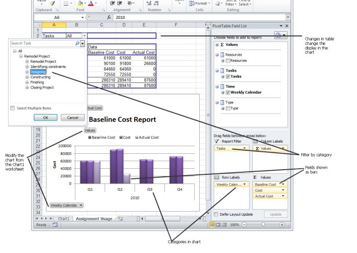
- Filter data. Like filtering in Project, you can filter the information that appears in a visual report. To use a field as a report filter, drag the field into the Report Filter box in the task pane. In the pivot table, expand or collapse items or turn specific items on or off. You can filter in other ways by clicking the down arrows to the right of the other fields in the pivot table — for example, to the right of the cell that says “Year.”
- Categorize information. The rows in a pivot table typically represent tasks, resources, or time. Changing the category is how you change your perspective of your data, for example, to look at cost over time or by task. You can also add categories to break down the data further, for instance, to look at cost per summary task and by each resource working on that part of the project. Just add another category to the Row Labels box.
- Expand and collapse data. Click expand buttons (+) or collapse buttons () in the pivot table to drill down to more detail or summarize your info.
- Format the chart. You can change the chart type, use a different bar style, and format labels. In some cases, you can simply right-click the chart and choose the formatting you want. Or you can use formatting commands.
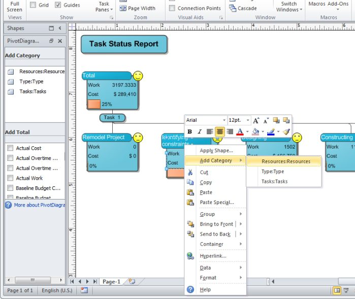
Visio-based visual reports use a Visio pivot diagram, which starts with a single top node that represents your entire project. You can break the diagram down to additional levels by adding categories. The nodes in a pivot diagram can include field values as well as icons to visually indicate status. Similar to their Excel siblings, Visio pivot diagrams can display different fields and categorize in different ways from level to level.
In addition to breaking the project down by category, changing fields within nodes, and filtering data, you can also combine nodes. For example, you can merge two summary tasks to show the total for both in a single node.
Think You Understand Reporting? Test Yourself!
The executive team wants to see the cost and effort for the top three levels of summary tasks in your project. They are interested in how much work is complete, whether tasks are on or behind schedule, and where cost stands compared to the baseline. You want to produce a hierarchical diagram that includes a progress bar for completion status for each task and icons to show schedule and cost performance. What must you do to generate this diagram?
A. Generate the Earned Value Over Time visual report.
B. Export the Project data to Excel and create a chart showing the status.
C. Run the Task Status Visio-based visual report.
D. Display the Tracking Gantt view.
No peeking! Scroll below the book ordering information to read the answer to this quiz.
Order the MCTS Self-Paced Training Kit (Exam 70-632): Managing Projects with Microsoft Office Project 2007.
To learn more about Microsoft certification, read, “Microsoft Project Management Certification: How to Get Started.”
The Answer to Test Yourself!
A is incorrect. The Earned Value Over Time report is a bar graph and doesn’t show progress by task as % complete.
B is incorrect. A visual report can show the information you want more easily than building your own Excel graph.
D is incorrect. You can customize the Tracking Gantt to show progress bars in the time scale and status icons in the table. However, the Visio Task Status visual report is already set up to show the information you need. In addition, you can quickly modify what you see in the report if the executive team asks questions.
Answer C is correct.
The Task Status Visio-based visual report shows a hierarchy of tasks. You can specify the number of levels you want to see. The nodes include the work and cost by default. A progress bar shows the percent complete. The nodes also include a happy face icon for status, as shown.