
 Project management is as much about communication as it is about delivery. In fact, a successful, on-time, on-budget delivery is often because of good communication, and communication is in turn tied to how the human brain works: how we understand each other, how we say one thing but mean another, or how we communicate things in ways that are easier for people to understand.
When you are managing a project, a lot of what you’re trying to do is communicate that project to your stakeholders, many of whom have different levels of engagement and expectations. Nonetheless, the project manager is only successful when these stakeholders can be aligned on the same set of initiatives. If you can communicate effectively, you’re going to have a much better chance of ensuring all of these parties are in alignment, and that everybody’s on the same track to the same final destination.
Learn more about the connnection between cognitive psychology and project management in the MPUG webinar featuring author Safford Black, now available on-demand.
How Psychology Fits In
In psychology, we try to understand how we can best communicate and how the brain actually processes information. Anyone on the receiving end of your project communications is going to take information in through their eyes and process it in their brain. Do you have an understanding of what is going to resonate with your audience and how it will be perceived?
As somebody with a background in psychology who spends a lot of time working with project managers, I believe these things come together naturally or me. On one side we see the academic understanding of how the brain processes information, and on the other side we see which project leaders, teams and initiatives are successful (or not).
The Correlation between Project Success and Visual Communication
Not to sound trite, but a picture truly is worth a thousand words — especially when you’re trying to communicate something very complex, which most projects are. Although there are people who describe themselves as textual learners, the science says this is just their own flawed perception.
We’re still cave people and visuals are still the best way to communicate. When you try to communicate something that has some complexity, showing somebody a gigantic data set or talking endlessly for an hour about the details is just not as effective as giving somebody a clear, succinct picture of where things are and where things need to go in order for them to understand what’s needed for that project to be successful.
Let’s examine one form of visual communication — the Gantt chart — to see how this plays out.
Gantt Charts
Gantt charts are the most traditional way to show project information visually. They’re read left to right, with a time scale at the top — year by year, week to week or sometimes even minute to minute. This gives a sense of time from start to finish. Displayed vertically are tasks or deliverables — the things that you are trying to accomplish in that project.
There’s quite a bit of complexity with managing dependencies and relationships between the tasks and milestones in a plan, and a Gantt chart is going to give you some indication of what that logic looks like, because it gives you the entire data stack in a visual format where you can see in one place everything that’s going on.

Good Gantt Charts vs. Bad
For every great Gantt chart, there are probably 10 more that range from mediocre to downright terrible.
Gantt charts in general have earned a bit of a negative reputation, which has to do with a lack of training on the part of the creator on how to make them effective. Gantt charts are often cluttered, containing more information than is required while at the same time lacking the information that’s critical. In other words, you can miss the mark both by showing too much information in some areas and not enough correct or relevant information in other areas.
How to Make a Better Gantt Chart
There are number of best practices we’ve identified over the years, looking practically at how people are successful with projects and more academically at the roots of cognitive psychology. In general, we’re examining what works well with visuals and what doesn’t, and a number of those best practices can be applied to Gantt charts, project reporting and project visualization in general.
- Use color well. Correctly using color (in the right amounts) is by far the most important thing you can do. Let’s pretend you’re looking at a pie chart, but it’s all one color; it’s all grey or all blue. It loses its meaning almost instantaneously because the color resonates with our brains. Our minds are trained from a very early age to pick up on differences in color. So, if you can add color to your project timeline or to your Gantt chart in a smart way, then it’s going to really help bring things out on the page. You could still have 100 tasks in your Gantt chart, but if 20 percent of them are color coded red because they’re are late, that group of tasks is going to be much more apparent to the audience.
- Less is more. Remember, you’re often trying to create something that fits on a PowerPoint slide. Think about your audience and boil things down to their essential elements.
- Increase understanding by grouping and sorting your data intelligently. Many organizations use swimlanes for this purpose. A swimlane can show who’s responsible for what in a given phase or a given group. A project plan might have five swimlanes for five different phases of the schedule; it provides an easy way at a glance to determine which tasks are part of which phase.
Cognitive Psychology and the science of data visualization are not new topics. They’ve been studied for quite some time. One world-renowned expert is Edward Tufte, author of a line of best-selling design books. While he does speak a little bit about project management, he also speaks much more broadly about visualization and how you can take very complex things and boil them down into a picture that really helps people understand the underlying message.
People like Tufte who study data visualization definitely impart a number of best practices, and the best practices that we recommend when it comes to project visualization are definitely rooted in a lot of what the academics speak about. The two disciplines mesh quite well.


Mark E Read
Thank you for publishing this! I look forward to your next piece on Daniel Kahnemann and how behavioral economics is crucial for understanding good project management practices. Tufte, alas, could have benefitted from the PM knowledge areas, as he would be more grounded in reality, not just the academic pursuit of pretty pictures. In the end, good design is crucial to understanding, and I appreciate your enlightening the dialogue.
Dennis Westendorf
Safford, nice article, and thank you for emphasizing the necessary intersection of art and science in project management that must happen during project communication. Failing to communicate technical data in a way (or ways) that stakeholders can understand and act upon can have disastrous results on a project, as illustrated by Tufte’s analysis of the Challenger disaster.
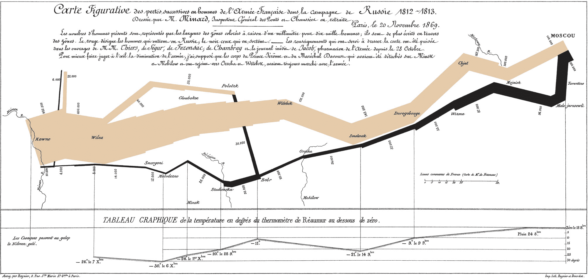
Also, thank you for including the graphic of Minard’s map of Napoleon’s 1812 march on Moscow. It illustrates how a simple graphic with multiple elements can convey powerful information. You may want to add an attribution link to Minard and/or Tufte when you include that graphic. It is considered one of the best examples of the art of visual communication of technical data.
Sonya Calef
Fine detail views are great for some audiences who work in fine details – finance, developers. The higher up in the organization someone in the audience is, the more abstract it needs to be. But, you better be ready to zoom down to the small details in a heartbeat when they ask a tough question – but don’t stay there! It’s a pickle to present to a combined audience of abstract & strategic people *and* the very tactical/specific thinkers at the same time. One group will be lost and the other group will be critical that you’re not getting it right. It’s a job hazard!