Organizations that use Microsoft Project Online or Project for the web to manage their portfolio of projects often need to develop reports that can support Executives, PMO Members, Project Managers, and other key users in understanding how these projects – alongside with resources – are consolidated, and also how they are performing.
To help users get up to speed, Microsoft has developed two Power BI Content Packs designed to be used with the PPM solution: an initial version designed to work with Project Online and a more recent version that reads Project for the web data. In a previous blog post, I shared an overview of the Power BI content pack for Project for the web.
Although the content packs are very powerful at allowing organizations to see a complete view of their portfolio of projects and resources, there is always space for enhancements. My duties as a PPM consultant are a very good source of ideas for extending the out-of-the-box functionalities of the PPM platform and its components, as I am always working with customers that have different business requirements.
In the following article, I’ll be sharing some examples on how to use Power BI’s custom visuals to extend the native reporting functionalities.
What are Power BI custom visuals?
Power BI comes with a collection of visuals that can be used to create powerful reports and dashboards. However, there are scenarios in which users might want to create a specific report where the native visuals do not support their needs –this is where custom visuals come into play.
In Power BI, individual developers (or formal organizations) can create visuals that are not part of the out-of-the-box collection included in Power BI desktop. These custom visuals are stored in the appsource website, and can be incorporated into Power BI desktop to provide report authors with a wider range of possibilities for creating reports.
As an example, the two content packs for the PPM solution provided by Microsoft use a custom visual called Gantt to demonstrate how the projects are spread over time, based on their start and finish dates.
Custom Visual #1: Funnel with Source by MAQ Software
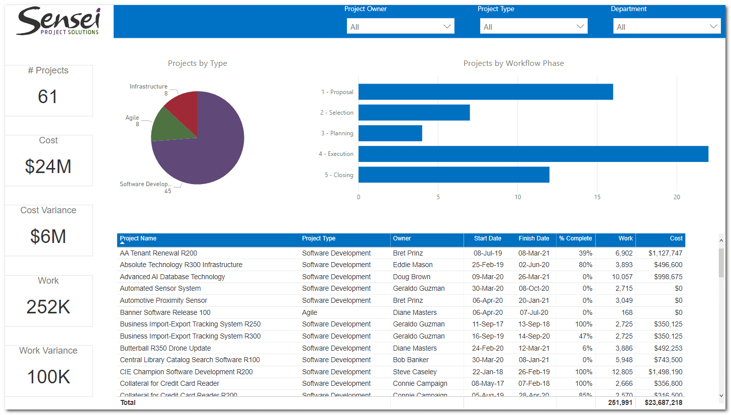
If your organization has defined a structured governance process for using the PPM solution, you might have developed a workflow that supports the phases and stages that consolidate that process. In that sense, a common scenario for report authors is to create a report that displays how many projects are parked in each governance phase. If you happen to be using the native visuals available in Power BI, your report might look like this:
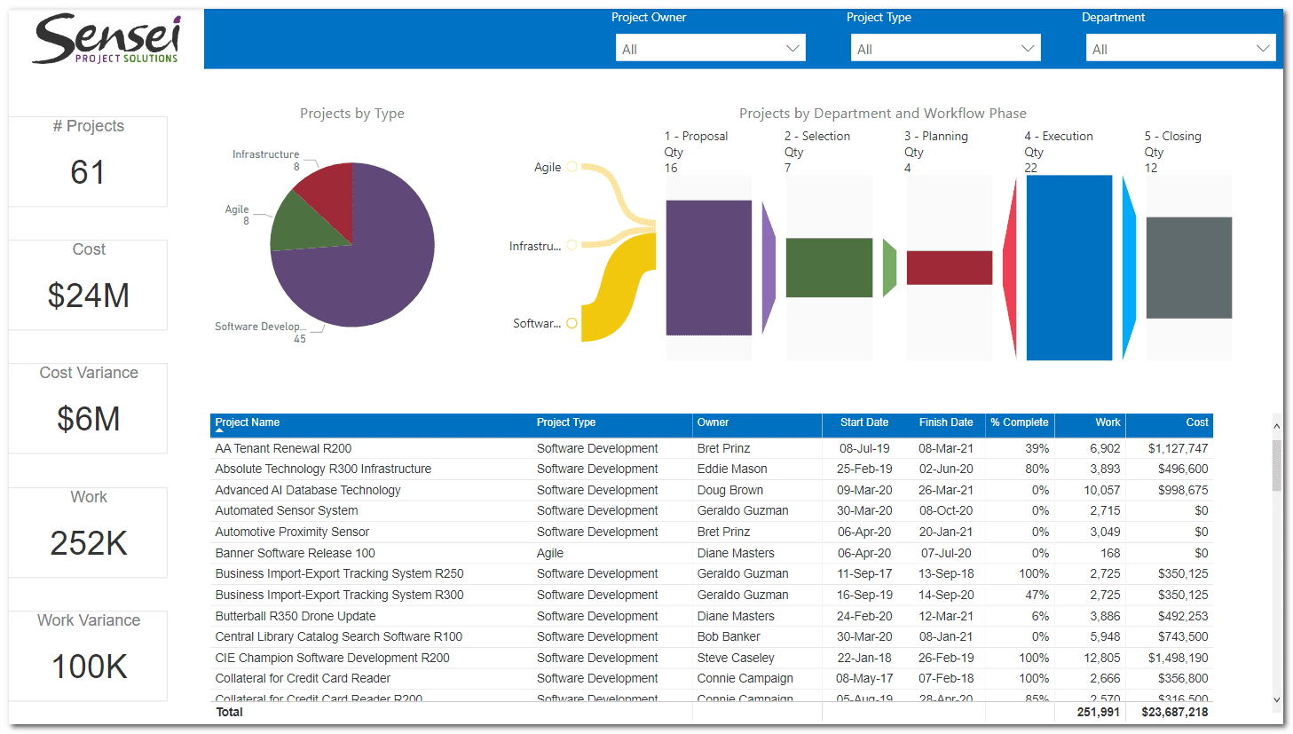
However, there is a very nice custom visual available from the app source website. It’s called Funnel with Source by MAQ Software. This visual shows a funnel journey that allows users to follow the path of a given metric over various stages, which perfectly fits to the scenario we have for the governance workflow phases. After obtaining the visual from the appsource and applying it to our report, we could provide our users with a much more comprehensive visualization like this:
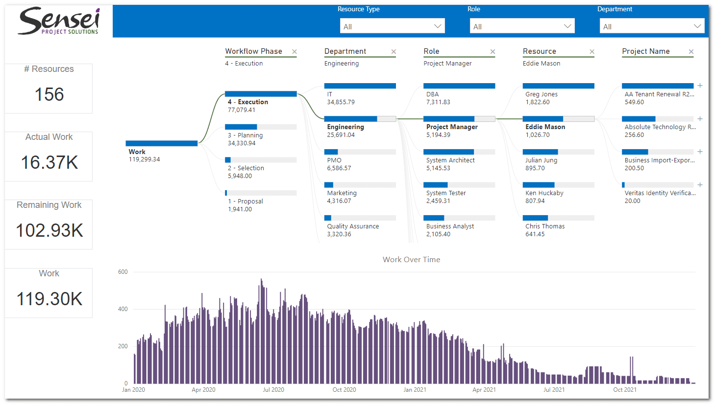
Custom Visual #2: Decomposition Tree
The second option I want to discuss isn’t necessarily a “custom” visual. The Decomposition Tree visual above lets users visualize data across multiple dimensions, by aggregating data and enabling the drilling into any order. At the time of this article’s publication, the Decomposition Tree visual is still in preview, which means that you must enable it from Power BI settings to be able to use the visual.
To illustrate a scenario in which using the Decomposition Tree visual would cause a very positive impact, imagine an organization that needs to understand the demand for its resources. This organization might have created custom attributes to categorize resources by Department, Team, and Role, and might want to use those attributes to consolidate the current demand that comes from assignments. At the same time, they might want to be able to see the current assignments in more detail, drilling to the lowest level and understanding which projects certain resources are assigned to.
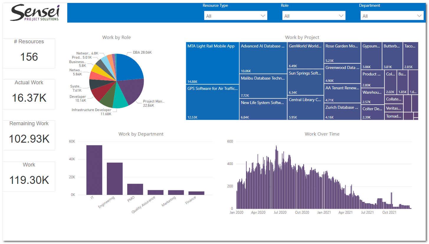
If you are using out-of-the-box visuals, you could build something like this:
Now, if you decide to use the Decomposition Tree visual, you’d provide users with the ability to pick what’s relevant to them, so they could expand the nodes and drill to the next levels based on their preference:
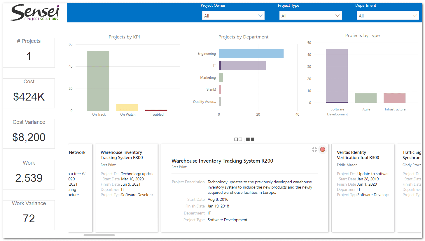
Custom Visual #3: Card Browser
In the past, I’ve worked with an organization that wanted to be able to consolidate their portfolio of projects by a few attributes (for example, by KPI, Department, and Project Type). Another requirement was to easily provide users with the ability to discover more information about a project without having to navigate back to the Project Web App site. In essence, the report’s audience was executives that didn’t want to spend time navigating back and forth between the workspace in Power BI and the Project Web App site, so all the relevant information about the projects should be available in a single page, and should also be easily discoverable.
To resolve that, I used an interesting custom visual called Card Browser, which is a very powerful visual for storytelling, because it allows users to see summarized information in a front-page card, then flip the cards to reveal detailed information:
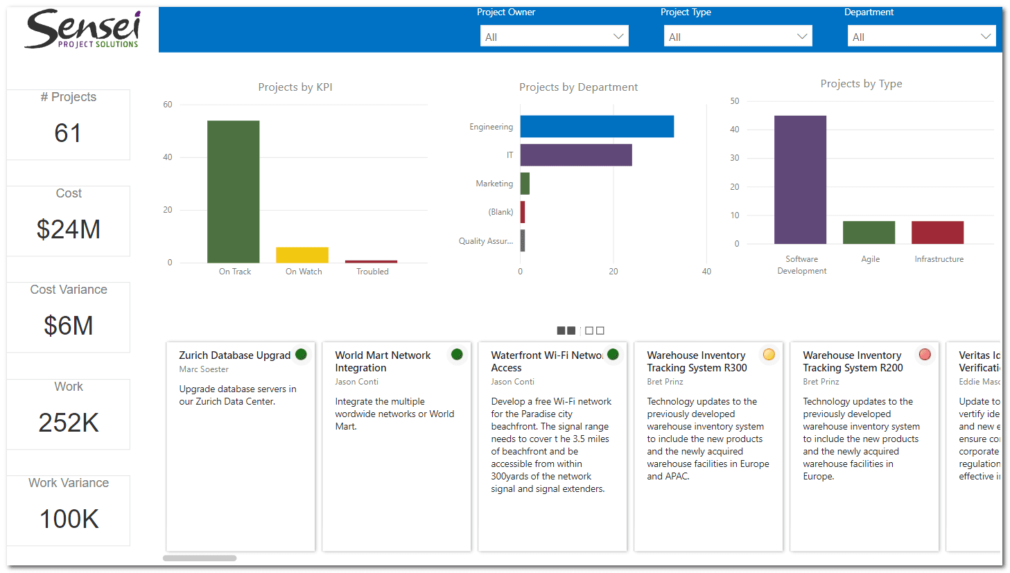
Once the user clicks the card, all the detailed information for the selected project is displayed:
Final Considerations
Custom Visuals are an excellent extension of Power BI, allowing users to show their data in a way that makes sense to their organization’s needs. There are lots of different custom visuals available out there, so if you have a special requirement for your reports, go check them out!
Watch my on-demand webinar, eligible for 0.75 PMI® PDU in the Technical category of the Talent Triangle, to learn more. It will be a hands-on session where you’ll learn how to use custom visuals to take your PPM reports to the next level! We will build a report with three visuals that can greatly improve the way Executives, PMO members, and Project Managers can see, evaluate, and interpret their project, resource, and portfolio data providing them with more accurate user-friendly information so they can make better decisions.
This article originally appeared on Sensei Project Solution’s website.