 Back in 2015, my colleague Nate Auchter wrote a great article in which he demonstrates how to build a key performance indicator report in Project Online using Microsoft Excel. (The full article can be found on the MPUG website here.) While Nate’s article uses a subjective custom field to create the KPI, this article places the focus on creating custom columns with data retrieved from Project Online to calculate and display the KPIs — so users would be able to evaluate the performance of the entire portfolio of projects based on live data.
Initial Step: Define KPI Criteria
The first step in building a KPI report is to define which is the criteria that will be applied to the data. In this example, we evaluate the projects by three measurable metrics: schedule, work and cost.
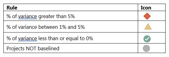
The main goal will be to discover the percentage of variance for the three metrics and then display a collection of stoplights based upon the results. The criteria will be the following:
Retrieve Data from Project Online
To get started building our report, the initial step is to retrieve the data out of Project Online and bring it to Microsoft Excel. We’ll use two data connections from the OData feed: Projects and Project Baselines. Follow these steps:
- Open Microsoft Excel. On the Data tab, click From Other Sources | From OData Data Feed.
- To get only the fields and projects that will be used in the report, use the following query by copying and pasting it in the data field location. Don’t forget to replace the <YOURCOMPANYTENANTNAME> text with the name of your company’s tenant):
https://<YOURCOMPANYTENANTNAME>.sharepoint.com/sites/pwa/_api/ProjectData/Projects()
?$filter=ProjectType ne 7&$select=ProjectId,ProjectName,ProjectOwnerName,EnterpriseProjectTypeName,
ProjectStartDate,ProjectFinishDate,ProjectDuration,ProjectCost,ProjectWork,ProjectFinishVariance,
ProjectCostVariance,ProjectWorkVariance,ProjectPercentCompleted
- Click Next. At this point, you might get prompted to insert your credentials to authenticate in your Office 365 tenant. Inform your credentials to proceed (if applicable).
- In the next dialog, select the table that contains the data we want — in this case, the “Projects” table — and click Next.
- In the next dialog, you can give a friendly name to your data connection so it will be easy to identify and use in the future. After doing that, click Finish.
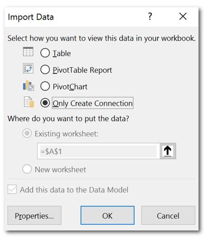
Finally, when finishing the import process, select the Only Create Connection option.
The steps above will pull the selected data from the Projects table. Now you need to retrieve the complementary data, which is stored in the Project Baselines table. Follow the same steps we took previously, changing the query to the following:
https://.sharepoint.com/sites/pwa/
_api/ProjectData/ProjectBaselines()
?$filter=BaselineNumber eq 0 & $select
=ProjectId,ProjectBaselineCost,ProjectBaselineDuration,ProjectBaselineWork
Manipulate the Data
Even though we have all the data required to build the report, at this moment there’s not much we can demonstrate with it. To make the data meaningful we need to manipulate the data connections by establishing a relationship between them and creating some calculated columns. All of this can be accomplished through Power Pivot.
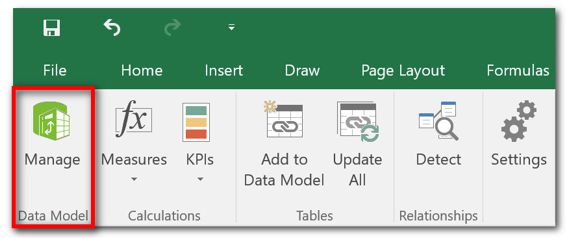
In Microsoft Excel, on the Power Pivot tab, click Manage:
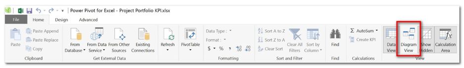
The first action to be performed is to create a relationship between the two tables. Once Power Pivot is launched, click on Diagram View:
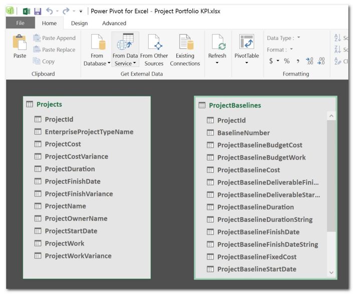
You will see the two tables with the data that has been retrieved from Project Online:
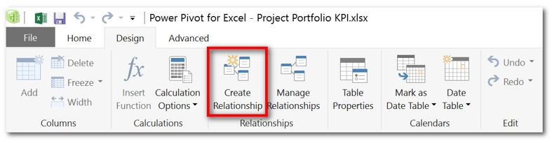
To establish a relationship between them, on the Design tab, click Create Relationship:
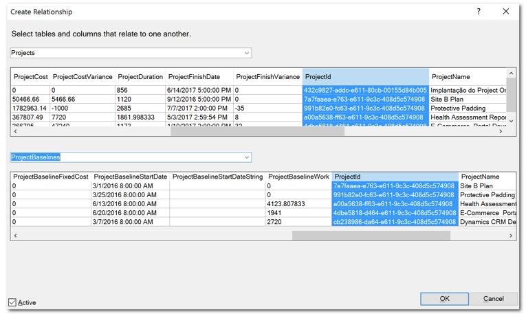
On the Create Relationship dialog, first select the Projects table and then the ProjectId field. Then, select the ProjectBaselines table and the ProjectId field and click OK:
After creating the relationship, on the Home tab, click Data View to return to the visualization of the data.
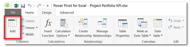
Once the relationship between the tables is established, your next action will be to create the custom columns that will calculate the percentage of variance for schedule, cost and work. In Power Pivot, on the Design tab, click Add:
First, we’ll create the custom column that calculates the percentage of finish variance. Use the following expression, which you can once again copy and paste:
=IF(RELATED(ProjectBaselines[ProjectBaselineFinishDate])=0,-100,
[ProjectFinishVariance]/RELATED(ProjectBaselines[ProjectBaselineDuration])*100)
After creating the custom column, you can right-click it and rename it to “Percent Finish Variance” (or another name of your preference).
Now you’ll need to create two more custom columns. Follow the same steps, using the expressions below:
Percent Cost Variance
=IF(RELATED(ProjectBaselines[ProjectBaselineFinishDate])
=0,-100,IF([ProjectCostVariance]=0,0,[ProjectCostVariance]
/RELATED(ProjectBaselines[ProjectBaselineCost])*100))
Percent Work Variance
=IF(RELATED(ProjectBaselines[ProjectBaselineFinishDate])
=0,-100,IF([ProjectWorkVariance]=0,0,[ProjectWorkVariance]
/RELATED(ProjectBaselines[ProjectBaselineWork])*100))
Once all custom columns are created, you can close out Power Pivot and return to Microsoft Excel.
Build the Report
Once we have all the data that we need, we can start building the report. In Microsoft Excel, click Insert | PivotTable. Keep all the selections that were offered by the wizard and click OK. Next, in the contextual PivotTable Tools section in the Ribbon, click Design | Report Layout and select the Show in Tabular Form option:
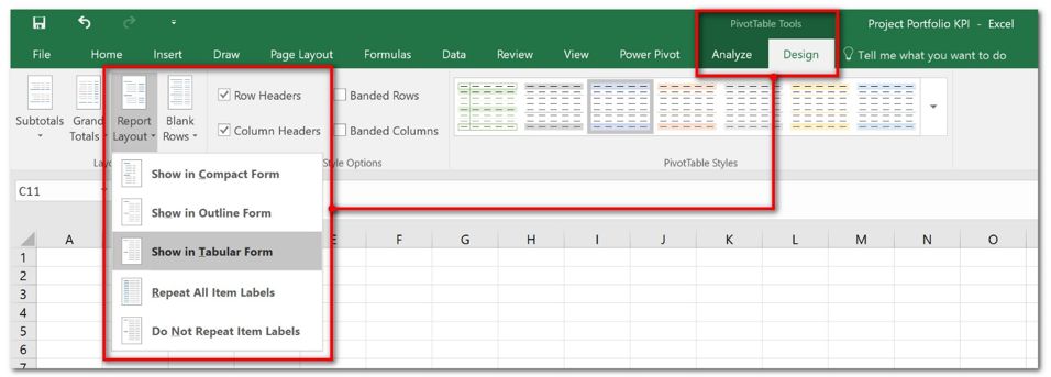
In the same contextual menu, click Design | Subtotals | Do Not Show Subtotals.
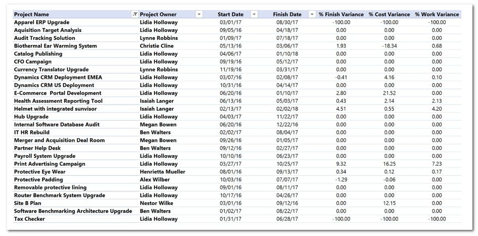
Now, add the fields that will be part of the report to the pivot table. Drag and drop the fields to the pivot table areas as follows:
Rows area:
- Project Name
- Project Owner
- Start Date
- Finish Date
Values Area:
- % Finish Variance
- % Cost Variance
- % Work Variance

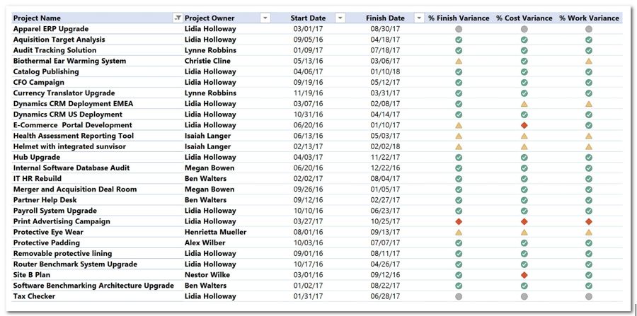
You can also remove the unneeded subtotals and apply formatting to the fields in the pivot table report based on your preference. The result might look like this:
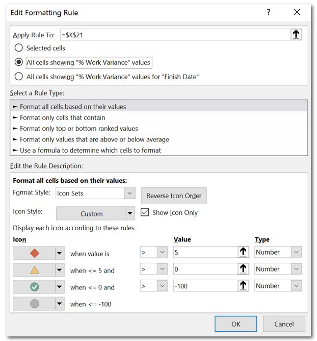
As we want the percentage variance fields to display the stoplights accordingly to their values, we need to apply conditional formatting to them. Select one value in the % Finish Variance column and click on Conditional Formatting | New Rule:
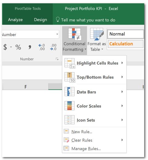
The rule will be applied as follows:
- In the Apply Rule To option, select All cells showing “% Finish Variance” values for “Finish Date.”
- In the Select a Rule Type section, keep the Format all cells based on their values option selected.
- In the Edit the Rule Description section, do the following:
- On Format Style, select Icon Sets.
- On Icon Style, select one option that displays for possible icons (any of the available ones) and check the Show Icon Only option.
- On Display each icon according to these rules, you will have to apply the following configuration:
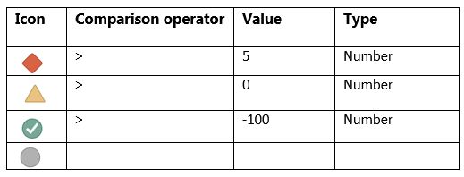
The result will look like this:
After applying the rules, click OK to see your results. You then need to create the same rules for the two other custom columns (cost and work). The final result will look something like this:
Finally, you can make your report look better by adding slicers, title, logo and legend:
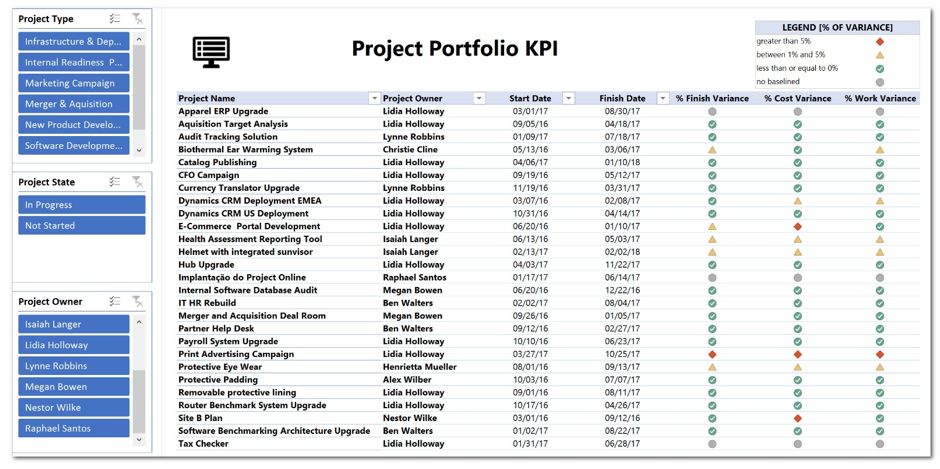
Remember that you can adapt the rules that have been used in this example to better align the icons to your company’s standards.
Once you’re ready to go, you can upload the report to your company’s Project Online instance and make it available to the appropriate users.
Do you have your own techniques for reporting KPIs? Share them with the rest of the MPUG community in the comments below!