
Gantt chart is the default view in MS Project. Since the inception of MS Project (MSP), Microsoft engineers have used Gantt chart as the default, although I have often wondered why they didn’t choose some other view.
I think Network diagram may have been a better choice, as it is a much better tool for network analysis, but, as discussed in my article on scheduling analysis, even though Network diagram is a good tool, it has its shortcomings. Only a trained person can understand a Network diagram. On the other hand, Gantt chart can be understood by anyone. I believe that even a lay person could understand Gantt chart at first glance.
Another reason for making Gantt chart the default view could have been the ease it provides for giving presentations and making status reports. Beautiful, informative reports can be created by simply taking screen shots of Gantt charts. Users can also create reports by printing the Gantt chart view(s).
The figure below provides a screen shot of the default Gantt chart view of MSP.

Notice that it is very easy to comprehend the information. Many can easily make out the start and finish dates and span of each task by just looking at the chart.
Sometimes, the default view is enough, but you may want to show more information than only that which is shown by the default view. In this article, I will share several different ways to customize Gantt charts in MSP. You can use these features on Tracking Gantt, also.
Four Ways to Change Gantt Chart in MS Project
Use the Format menu in MSP to make changes to a Gantt chart. The figure below shows the Format menu.

1. Customize Bar Styles
The normal style of a Gantt chart seem to be drab and not suitable for making formal presentations. You can change the styles and colors of Gantt chart bars in one of the following two ways:
- Use any one of the canned styles from the Format -> Gantt Chart Style.
- Create your own style by going to the advanced option menu. You can do this either by right-clicking anywhere in the blank area of the Gantt chart view and choosing ‘Bar Styles,’ or by clicking at the bottom right where you will see Format -> Gantt Chart Style. Refer to figures III and IV below.


MSP shows different types of bars for different task types, and you can change the shape, pattern, and color of each of these.
In addition to changing styles in theviewing area, you can also change the legends shown in the print view. This is very useful when you are printing Gantt charts for reporting purposes. Refer to another article that provides information about changing legends in MSP.
2. Add Text to Bars
Another useful customization techniques is to add text to the bars. This makes the Gantt chart more informative. Do this either by right-clicking anywhere in the blank area of the Gantt chart view and choosing ‘Bar Styles -> Text, or by clicking at the bottom right on Format -> Gantt Chart Style. Refer to figures III and IV above and V below.

MSP gives you five placeholders for adding text: left, right, top, bottom, and inside of a bar.
You can even change the bar style of a specific task. This can be done by right-clicking on the bar in the Gantt chart view and choosing the ‘Format Bar’ option. Refer to the figures VI and VII below.


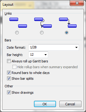
3. Change Layout
Change the layout of the Gantt chart area, which includes date formats and link styles among a few other things. You can do this by right-clicking anywhere in the blank area of the Gantt chart view and choosing the ‘Layout’ option. Refer to figures III above and VIII below.
4. Change Timescale
In the default view, timescale shows in weeks, but you can change it to hours, days, months etc. Do this by right-clicking at the top of Gantt chart view and choosing the ‘Timescale’ option. Refer to figures IX and X below.


There are various other options in the Timescale dialog box. Just play with them and check those which are useful for you.
5. Change Gridlines
MSP provides an option to add Gridlines to the Gantt chart area. Do this either by right-clicking anywhere in the blank area in the Gantt chart view and choosing ‘Gridlines,’ or by clicking on Format -> Gridlines at the bottom right of the screen.

Conclusion
Gantt charts are very useful for making client presentations and status reporting. They are easy to understand and provide a detailed status of a project at a glance. Utilizing the advanced formatting features available make Gantt charts more visually appealing. You can explore these features and play with different styles and text options to check what works best for your project.
Do you use Gantt charts for status reporting or for client presentations? Which customizing options do you find most useful? I would love to hear your thoughts in the comments below.
