
In this article you’ll learn how to create an amazing report with the new Microsoft Power BI Gantt Custom Visual. A Gantt chart is a kind of bar chart that shows a project timeline or schedule. As Microsoft notes in its Power BI gallery listing for the Gantt chart, the visual you’ll be working with here “shows the Tasks, Start Dates, Durations, % Complete, and Resources for a project. The Gantt Chart visual can be used to show current schedule status using percent-complete shadings and a vertical “TODAY” line. The Legend may be used to group or filter tasks based upon data values.”
Let’s get started.
Allan Rocha also presented a webinar for MPUG members on how to report your Project Online resource engagements data using Power BI custom visuals.
First, make sure you’re working with the latest version of Power BI Desktop. (If you’re using the cloud version of Power BI), you already know you have the latest edition. Next, download the Power BI Custom Visual Gantt. The gallery is a collection of interactive reports created by Microsoft folks and others in the Power BI community who have donated their efforts to the roster.

Under visualizations, click on Import.
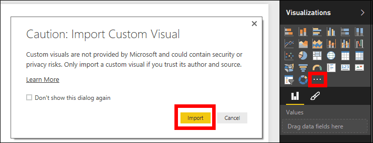
Select the Gantt.pbiviz file.


Click on the Gantt icon, under visualizations, to add the visual and look at the fields available for this chart (Legend, Task, Start Date, etc.).

Learn how an MPUG Membership helps individuals and teams become better project managers and Microsoft Project users through Microsoft Project Training.
Join MPUG to attend live training webinars, access 500+ hours of on-demand sessions, receive certificates of completion and earn the Project Management Institute (PMI)® Professional Development Units (PDUs) that you need. Watch an MPUG training webinar for free and improve your Microsoft Project skills in less than 1 hour.
For the chart we’re creating, I’m using the following tables:
- Assignments;
- Resources; and
- Tasks.
We’ll place the fields in the following order:
- Legend: Role (Resource)
- Task: TaskName (Assignments)
- Start
- Date: AssignmentStartDate (Assignments)
- Duration: TaskDuration (Tasks)
- %
- Completion: TaskPercentWorkCompleted (Tasks)
- Resource: ResourceName (Resources)

Add some extra charts and slicers (an alternate way to do filtering that narrows the portion of the dataset shown in the other visualizations on the page).
And you’re done! You have now a Power BI Gantt chart ready to use!

Let’s publish it to Power BI by clicking on Publish.
 gantt chart” class=”wp-image-395909″ width=”300″ height=”52″/>
To access your Power BI report, remember to enable custom visuals.


Enjoy the quick GIF below to see how cool your work is in real life!

A version of this article first appeared on Allan Rocha’s blog, ppm4all.
Is there a particular Power BI custom visual you like to use? Let the MPUG community know in comments below!
Related Content
Webinars (watch for free now!):
Back to the Future – When Gantt has Style
Articles:
Storytelling with Your Gantt Chart
