 Let’s say you were to meet gold medal sprinter Usain Bolt and say to him, “Here’s a great track in front of you. You run. We’ll monitor your running and declare you the fastest!” Would he run? His response would probably be, “Run against what?” If you said, “Just run, man! Don’t worry about the distance!” would he listen to you?
Measurement, it seems, is inevitable and will be expected in many facets of life. In competitive sports or activities, measurement is used to gauge performance and prove who’s the fastest or strongest. Judges measure against a baseline, such as 100 meters of distance, which is fixed and sacrosanct — inviolable so that earlier World records or Olympic records won’t be questioned.
But measurement in software development is different. Measurement isn’t one developer against others. It’s not about declaring someone as the fastest or cleanest coder or quickest bug fixer compared to others. Nor is anybody vying to break an existing organizational record. And baseline, while it should be respected, need not be sacrosanct. The idea of measurement in an unpredictable and complex environment such as software development tends to examine answers to these kinds of questions:
- What have we done so far?
- How far away are we from our current iteration goal and overall project goal?
- What are the areas of trouble in the development team’s work? How the team can be helped to do better?
- Are we improving or what should we focus on for the team’s improvement?
- Are we producing better products with fewer defects?
When it comes to agile development, specifically, those questions apply as well as one of the principles, as outlined in the “Manifesto for Agile Software Development“: “Working software is the primary measure of progress.”
But how do you measure that kind of progress? In this article I’ll share five metrics and their requisite charts, which are important in agile development:
- Iteration burndown chart;
- Release burndown chart;
- Release velocity histogram;
- Cumulative flow diagram;
- Iteration burnup chart;
To understand iteration, velocity and story points, I suggest you read my earlier post on the subject, “Understanding Project Estimation in Agile Development.”
Iteration Burndown Chart
A burndown chart such as the one below shows the progress of the team in the iteration. (For Scrum, an iteration is called a “sprint.”) Simply put, it’s chart that shows the remaining cumulative work for an iteration.

The horizontal or X axis shows the number of days in the iteration; and the vertical or Y axis shows the number of remaining cumulative hours. To plot, start with the number of hours left in the day — in other words, the total remaining hours. As your team progresses, at the end of every day, plot the remaining hours. Now draw a line connecting the two. Note that many times burndown charts tend to go up in the initial few days as the team may have underestimated or certain earlier unplanned tasks are added, but that need not always be the case.
A variant of this chart adds baseline information, as shown with the dotted red line in the figure below. You may choose to include it if everyone is familiar with it. But if that isn’t the case, adding the baseline may communicate misinformation that your team is doing less work than planned.
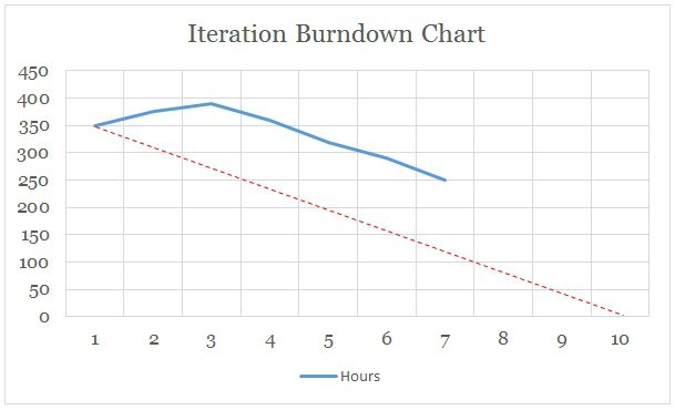
You might ask, should the non-working days in the iteration be shown? If you do show it, you’re likely to get a reverse S curve.
Release Burndown Chart
The burndown chart can also be plotted for the release. The horizontal axis shows the number of iterations and the vertical axis displays the number of story points.
In this case we started with 300 story points — the total number of story points for the release. At the end of iteration one we have 270 remaining cumulative story points. If story points are added, then the curve will go up as it has happened for iteration four.

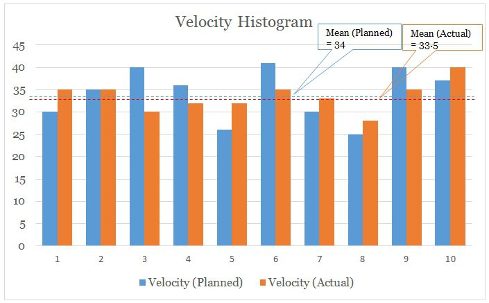
Release Velocity Histogram
Velocity, as noted in my earlier post, is the sum of story points completed in an iteration. The histogram used to display this metric represents the velocity for each iteration in a vertical bar chart — planned and actual.
Velocity may not remain uniform throughout the iterations in releases; hence, it’s a good idea to show the stakeholders the trend for the last few iterations to give them an idea about what to expect in the future. You can communicate this by drawing over a mean line.
Here I show two types of velocity data: planned or committed velocity by the team and actual velocity. The dotted lines show the averages of the last 10 iterations.
Cumulative Flow Diagram
This flow diagram is cumulatively represented to provide insight into how many items are completed and where the bottlenecks are in the process flow.
In my example I’ve taken the cumulative diagram for the number of issues coming to the development team on a weekly basis. There are three workflow states: TODO, DOING and DONE.
Obviously, the TODO items are getting added up at a faster rate and becoming fattened, whereas the DOING items aren’t able to catch up and flow through a narrower patch, indicating the presence of a bottleneck. Also the team can’t seem to move the DONE items well either. From a technical standpoint, this suggests that either the items taken may be very big in size and hence needed to be broken up or that the team is unable to deliver on the issues taken up.
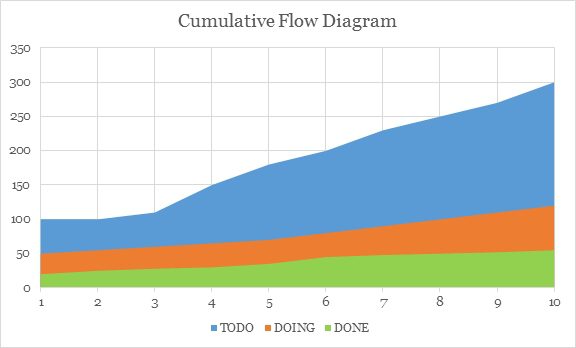
You need to be judicious while using cumulative diagram. It doesn’t relay how big or small the tasks are. I’ve also seen people use a number of workflow states and run a lower timescale on the X axis when a high number of issues is being worked upon on a daily basis, but I can’t really see the value in doing so.
Iteration Burnup Chart
This chart is different from the burndown chart. Here, it’s not about remaining cumulative work, rather cumulative work planned and actual. In this chart, the X axis shows number of days and the Y axis shows number of hours. At the end of every day you plot the number of hours you’ve worked and connect those points.
Compared to a burndown chart, in this chart the scope changes are visible. If the project has big scope changes (also called “scope creep”), a burndown chart won’t help. However, the burnup chart shows both the actual cumulative work done and the planned cumulative work, which, if there’s scope creep, will show change.

As shown above, the planned hours started with 600 hours of work. That changed on day 4, where around 50 more hours of work (due to scope change) was added. Then on day 7 there was a scope reduction.
This chart communicates either internally or externally that scope creep is happening. By adding trend lines to it, you can show that if the creep it continues, the items taken for the current iteration won’t be fully complete and will require some more time. Otherwise, you can request that the customer stop adding work if they want the features initially requested within the current iteration. Some practitioners don’t advise change in scope within the iteration; the scope remains fixed once the iteration has started. However, scope change is a reality in many projects.
Final Notes on Metrics
Just as with iterations, you can have both a release burndown chart and a release burnup chart. Other charts I’ve seen in use are:
- Release burndown bar chart;
- Bug counts;
- Impediment counts;
- Impediments created vs. resolved;
- Bugs created vs. resolved;
- Predicting the end date with trend lines; and
- Combinations of these, such as release velocity burndown with bug and feature count.
Your goal as the project manager is to choose and use the metrics that primarily help your team identify problems and improve productivity.
To return to the running analogy, by using metrics, you’re not asking your team members to run like Bolt. Rather, Bolt inspires us to try new things and to continue trying to get better every time we do it — that is the idea of measurement and metrics.
The Agile Manifesto references this value: “Individual and interactions over Process and Tools.”
While there’s value in the item on the right (the italicized font), we value the item on the left (in the bold font) more.
Metrics aren’t there as a substitute for interactions with or among the team members. They’re not there to identify which developer is good or bad. Metrics should move your team’s path forward, make the development work better and help build valuable software.
Do you have your own preferred metrics? Share them with the MPUG community in the comments below.