
While there has been a real move to Agile and hybrid methodologies in the last few years, predictive project management is not going away anytime soon. With that in mind, it is very important to learn what is considered the premier standard in project management scheduling – Microsoft Project.
Some Facts about Microsoft Project
According to Microsoft:
- Three copies of MS Project are sold every minute
- Project has over 20 million users
- Over 10,000 organizations use Project
- Project is sold in over 80 countries
Versions of Microsoft Project and Plan Comparison
From a cost standpoint, Project is one of the lowest-cost solutions for enterprise project management, with a wide variety of active versions available.
There are three cloud-based solutions and two on-premises solutions.
The three cloud-based options increase in functionality:
- Project Plan 1 is a basic web-based tool.
- Project Plan 3 adds additional tools in the web-based tool (resource management, portfolio management, etc.), and includes a copy of the desktop app.
- Project Plan 5 focuses on portfolio management and provides the desktop client.
The two on-prem solutions are primarily differentiated by portfolio management and implementation with Project Server.
Getting Started with Microsoft Project
Learning a software tool, especially one as complex as MS Project, can be intimidating, so before touching a schedule, look at a few resources for tutorials.
MPUG – Microsoft Project Users Group
MPUG’s website offers a ton of resources for the end user, on-demand and live webinars, articles, opportunities to earn PDUs, and other great training resources. The free content is great, and the price of membership is worth it for all levels of users.
Two of MPUG’s best courses to start with are:
Microsoft Project Practitioner Course – learn the Microsoft Project fundamentals and earn an MPUG certificate.
Advanced Microsoft Project Professional – get the credit you deserve with MPUG’s advanced Microsoft Project course constructed by leading experts.
YouTube
- Simon Sez IT
- Full course – Free
- Learnit Training
- Beginner course – free
Udemy – these go on sale so keep an eye out
- Microsoft Project ALL: BEGINNER to EXPERT 10 Projects
- Project Management with MS Project – Scheduling Master Class
- Microsoft Project Course Complete, 2013, 2016, & 2019 – this is Andrew Ramdayal’s course, and he is considered an industry expert in project management
Why is Microsoft Project So confusing?
Right off the bat, I want to discuss what many of us struggle with early on. Microsoft doesn’t particularly advertise that Project is interoperable as a project and program management tool, as opposed to other task and scheduling tools such as SmartSheet, Asana, and Taskr. What this means is that it performs multiple functions that collectively control how data is entered, output, reported, and calculated.
For example, there are tasks, calendars, resources, costs, and status fields. The calendar affects a resource’s availability, that resource has use costs, and the status fields track the state of the task. This is an extreme level of flexibility that can be overwhelming. Add in a robust reporting interface, and a highly configurable export function, and you have created a Formula One vehicle, whereas many users think they are getting a Honda Accord.
Most other tools operate as informational checklists. This task is assigned to this person to be completed by this date. Is it done? Check yes or no. This is great for a daily “to-do” list but provides very little insight into what it takes to run a project. What most people expect is a tracker, but Project is an enterprise management tool.
Let’s Cover the Basics
In the next few sections, we will get oriented with the basic functions of Microsoft Project.
Moving Around the Page
For the purpose of this article, we are using the desktop version – Microsoft 2019. Several releases ago, Microsoft rebuilt the interface to resemble the rest of the Microsoft 365 product line more closely, commonly called “the ribbon.” The ribbon is made up of tabs and groups.
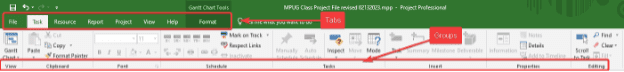
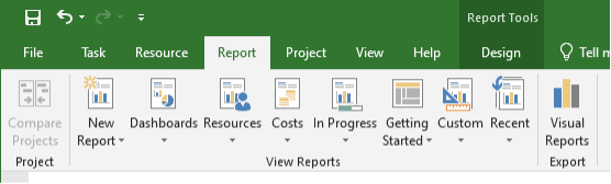
The File, Task, Resource, Report, View, and Help tabs are fixed, and the last tab will switch depending on the context of the schedule. For instance, we have a Gantt chart selected, and it has a format tab as shown above. If I choose a report, I will get a Design tab (see below). There are several context-based tabs. They will always be the last tab and will be titled with the context of the tab.
Some Good Buttons to Know
Like Microsoft Office 365, there are many common buttons, such as save, copy, paste, etc. so we won’t focus on those here. What we will do is look at some of the more specific buttons and functionality to make things easier for you.
Task Tab
Most buttons here are pretty intuitive, but there are several that need to be highlighted as they are often ignored.
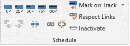
In the schedule section, there are buttons to mark percentages as indicated above, but two buttons here are important:
Split task – ![]() This button takes a single task and splits it along multiple dates. Many people create multiple tasks to handle this function, but that causes the user to have to monitor and control multiple tasks. Splitting it creates a single task, and keeps dependencies, slack, notes, assignments, etc. all part of that one task.
This button takes a single task and splits it along multiple dates. Many people create multiple tasks to handle this function, but that causes the user to have to monitor and control multiple tasks. Splitting it creates a single task, and keeps dependencies, slack, notes, assignments, etc. all part of that one task.
Inactivate – ![]() When managing tasks in your schedule, version control is important. Often a task, or series of tasks may be removed from the requirements, or canceled. Intuitively, most people simply delete the task. The problem here is that you are removing historical notes, status, and many other artifacts that might be relevant to the project. Inactivating the task will remove it from the schedule while keeping the history. As a side benefit, if the work comes back up, you can simply reactivate it and it appears back in the schedule.
When managing tasks in your schedule, version control is important. Often a task, or series of tasks may be removed from the requirements, or canceled. Intuitively, most people simply delete the task. The problem here is that you are removing historical notes, status, and many other artifacts that might be relevant to the project. Inactivating the task will remove it from the schedule while keeping the history. As a side benefit, if the work comes back up, you can simply reactivate it and it appears back in the schedule.
Resource Tab
In the resource tab there are several sections that are very straightforward: the team planner (kind of like a work schedule), assigning resources, and properties. Here we want to focus on resource leveling. While this is a powerful tool, it is often overlooked, and courses and articles could be written on this functionality alone. From a high-level perspective, here are some things to consider:
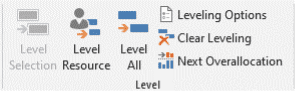
Think of resource leveling as a tool to manage the work. As a project manager, you need to determine how you will manage the team. This requires some resource planning, but as a basic example, if you have a similarly skilled team providing the same work, leveling the resources will split, reassign and move tasks to accommodate the availability of the assigned user. You can set your preferences in the ![]() box. The default options tend to be the most conservative approach except for one thing I prefer to change – the leveling range.
box. The default options tend to be the most conservative approach except for one thing I prefer to change – the leveling range.
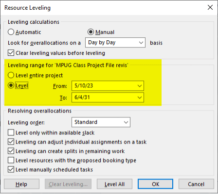
Here I always review this by date range. Things can change in a schedule very rapidly and frequent leveling may be needed. I will typically review by month or quarter.
Project Tab
The project tab has a few buttons you will commonly use, but three I want to focus on are:
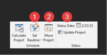
- Set baseline – you will be using this button to establish your initial baseline and after every significant change throughout the project.
- Move project – if, after building your complete project, you have a delay, you can use this to shift the entire project to a new start date, including moving any deadlines.
- Status date – this is a frequently ignored field as most people simply assume saving the file establishes the status. While partially correct, this date allows you to establish an update that can be used in formulas, and be read by Project Server. For instance, if you get all your updates on a Monday, and enter them in on the following Friday, you can establish that the updates are as of Monday, and all status reports are driven by that date.
View Tab
We will be covering the more significant portion of this tab in the next section. But another set of buttons to help navigate the often-complicated project can be found under the Window section:

Views, data, and columns
When accessing Microsoft Project, the first thing to keep in mind is that the file has no standard “look and feel.” The logic here is that like any time-based tool, we can look at it from different ways – chronological, by days/weeks/months, summarized, or even by various snapshots such as next 30 days, completed items, assignee, etc. Every file has two basic “looks” which are the view, and data.
The View
The view is the layout and type of schedule. Project has several standard views.
A view is made up of several components, three of the most important ones include:
- Tables – the fields to display
- Filters – criteria of the data to display
- Group – categories of data to display
There are several standard views included as a default in MS Project. There are several ways to switch views, primarily by task view section in the view tab, or right clicking on the far left boarder.
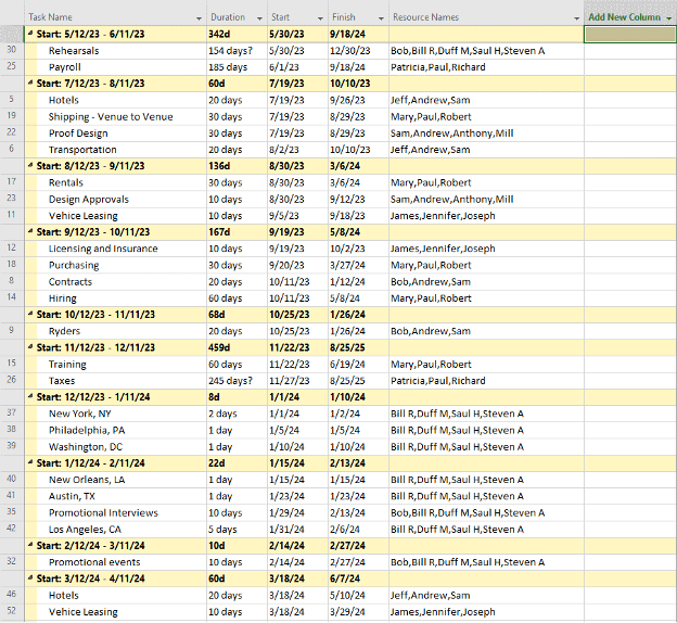
The most commonly known view is the Gantt Chart:
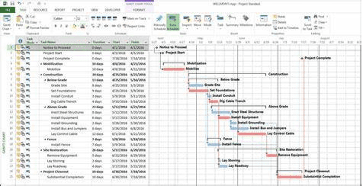
This displays a series of tasks on the left, with bars on the right representing duration. Additional labels, colors, and tags can be added to define these for easier navigation.
The Data
The data is a subset of the view. For instance, you can create a filter and apply it to any view. You can do the same with grouping, sorting, and applying outlines. Each of these functions will affect what data is displayed. For example:
Filter – display or remove certain tasks
- Display a list of tasks due to be completed within the next 30 to 60 days
- Hide all completed tasks
- Display all late tasks
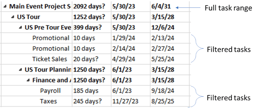
Below is an example of tasks filtered between January 2024 and September 2025 (starting and completing).
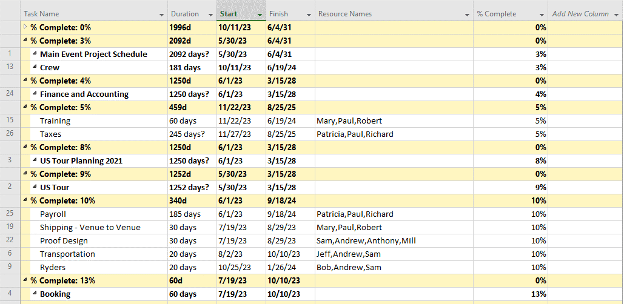
Group – cluster groups of tasks
- Complete versus incomplete
- Duration
- Resource (assignee)
- Active versus inactive
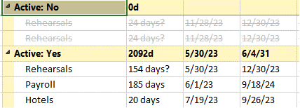
Below is an example of grouping active versus inactive tasks:
One of my preferred ways is to group tasks in time value groups such as weeks, months, quarters, etc. like so:
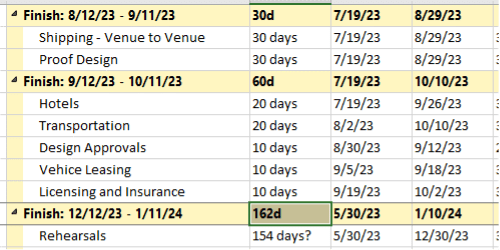
This is a great way to view where your project will need the most resources. It’s useful to see if you might have issues during busy times of the year such as around holidays, summer vacations, or other industry-focused ranges.
Displaying or Hiding Columns
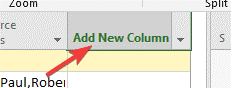
The final aspect of the look and feel is the columns. As a project manager, certain columns will be very important to you at various times. If you are looking at resources for instance, you will want to see their names, and you may also need to see notes, start dates, finish dates, etc. So, you can add or remove columns very easily in your view by clicking on “Add New Column” located at the end of the column group:
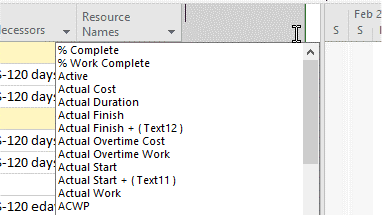
Then, simply scroll through the list and select the column, or start typing the name and the list will filter:
Alternatively, to hide a column, right-click on the column and select “Hide Column”:
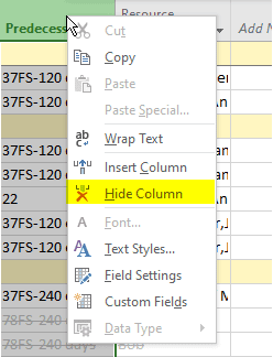
You will also see “Insert Column” above that item, which allows you to insert a column in any order within the view.
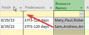
Reordering columns is simply done by dragging the column by the header to the preferred location. A grey reference bar will appear indicating the final placement of the column. The image below shows that “Resource Names” is being moved in front of Predecessors.
Bring It All Together
If you have followed along, you now understand the biggest challenge most people encounter making your schedule work for you under the circumstances in which you are using it. Below are a few examples of how you can create a look and feel and the circumstances in which you might use it.
Summary View:
All active tasks, summary level, with Task Name, Duration, Start, and Finish columns:
Resource Schedule View by Task Finish:
Resource Schedule View by Task Start:
Status report by percent complete:
Building your views and compounding your filters
Now that you see how these various tools can work together to help you at various times for various reasons, let’s build a custom view and compound the filter so you can apply multiple criteria. This involves:
- Creating a custom filter
- Selecting the columns
- Creating a group (optional)
Start with the filter:
Navigate to the View tab > Data Group > Filter menu item. Drop the menu down and select “New Filter.” This dialog box allows you to create a custom filter. You can name it and apply multiple levels of filters. For instance, the below example only shows active items, is less than 100% complete, and is within 90 days of starting (note “Days from Start” is a custom field, more on that later).
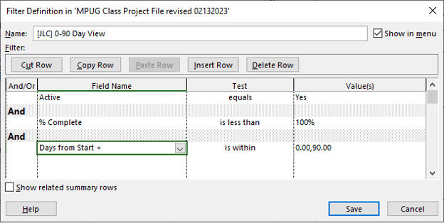
This filter starts from the top down, and it will not display any inactive or completed tasks starting within the next 90 days. Create a name for this filter, save, and apply.
A word about naming
As a best practice, I use this naming convention: left bracket, text, right bracket. For example:
[Filter Identifier] Filter name i.e. [Report] 30 day status
This does three things: first, it puts all custom filters at the top of the menu; second, it identifies that it is custom; and third, the filter identifier allows me to best determine how to use it. Microsoft Project uses filters for both schedule and report views. Sometimes I want a filter specifically for a report, so I will use that in the name. Other times it is a general filter, so I just use my initials.
Choose the Columns
Depending on the purpose of the view, you need to select the appropriate fields to display. What do you want to see from a data perspective? Answer these questions to determine what you need.
- Who is your audience? Most non-PMs don’t care about project management fields i.e. duration, predecessors, baseline, task mode, etc.
- What is the purpose of the view? Are you reviewing resource loading, upcoming activities, or project health and status?
- What order do you want to see the columns in? Sometimes a resource view for instance should have the assignee listed first. If you are looking at the schedule for errors or conflicts, you should have the indicators column first (
 ).
).
Apply or Create a Group
Groups are helpful, but I say they are optional because I will apply different groups to the same view to look at a schedule and get different perspectives.
If my filter is focused on tasks starting in the next 90 days, I may group it by month, then again by resource to look at loading.
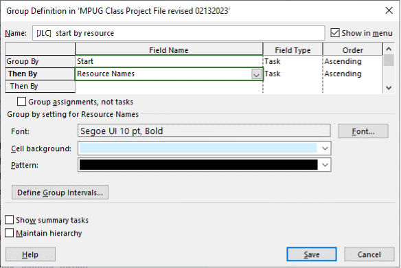
Here is how to build a single and multiple-layer group.
Single layer:
A single layer simply groups by one field, in this case, resource:
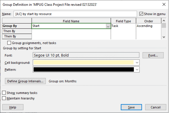
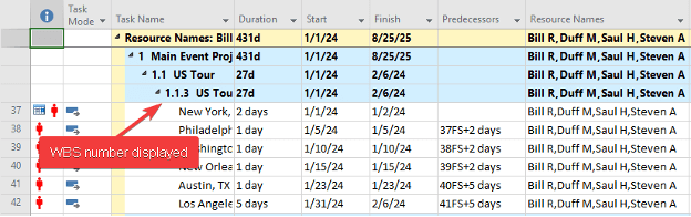
The cell background and pattern are customizable, as well as various other aspects. You can control other items such as order or display summary rows (but in this case, it is not relevant because you don’t usually have resources on summary rows). Notice I am using the same naming convention here as with the filter. If you select “Maintain the hierarchy” the schedule will display the WBS (Work Breakdown Structure) number and will look like this:
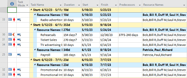
A multi-layer simply groups by one field, in this case, resource:
By selecting the group by line, you can configure the settings again. Here we are showing that the resource name will be highlighted in blue:
Now we have created a custom filter, selected the columns we want, and if preferred, grouped our tasks. The next step is to save and name the view.
Go to the view tab >Task Views and drop down the Gantt Chart button:
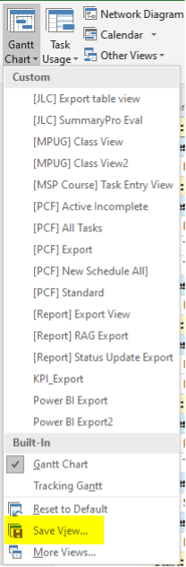
And select Save View.
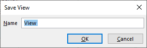
Again, I use the bracket naming convention and apply some context for the view.
Conclusion
While Microsoft Project can be a bit overwhelming at first, just remember that it is an “all in one” tool for project managers. While you can use only portions of the applications, the more functions you incorporate, the more benefits you can derive from it.
Just remember the key ribbon functions highlighted, and focus on the views, filters, and groups. If you start with those functions, the rest will become much more intuitive.
Bookmark this article to reference whenever you need it, and dive into MPUG’s resources to build your proficiency in Microsoft Project. You’re on your way to a successful and rewarding career in project management!


Ronald Smith
Excellent overview article!